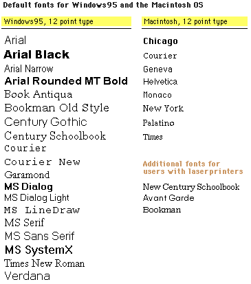
This picture originally found here in the Yale Style Manual.
Go there to find many more helpful tips.
Fonts are a messy thing when in comes to webdesign and there are many articles on the abhorrence of FONT tag use. The main arguments against it is that it is not as easily overrided by user agents (eg, with a user-defined browser style sheet) as text and background colors set in the BODY tag, which can make for hard-to-read pages that you did not foresee. Also, FONT and BASEFONT are depreciated in the new HTML 4.0, so it's a good idea to move away from them. Style sheets, such as CSS, are supposed to take their place, and though they may be a little erratically rendered these days, things are improving and continuing in this direction.
I originally started using the FONT tag when I learned how the same fonts appear different sizes on the screen depending on the browser and the operating system.

This picture originally found
here
in the Yale Style Manual.
Go there to find many more helpful tips.
This was a major problem when I aligned pictures to one of the margins because, with smaller fonts on some systems, the images would start stacking against each other rather than against the margin and majorly screw up the look of the page. I used <FONT face="Geneva, Times New Roman" size="3"> in an attempt to get a consistent size across platforms. But this got tiresome to repeat in each paragraph when I learned that FONT is an inline element, not a block level. This means that you can't validly state it at the beginning of a page and turn it off at the very end of the page and have it apply to all table and paragraph content in between, though most browsers are pretty lenient on this one. So I moved to BASEFONT, which you can state at the beginning of a page and it applies to everything and you don't have to turn it off. But then I found out that most browsers only support the size attribute with BASEFONT; Internet Explorer was the only one to also support face and color. Which basically makes BASEFONT pretty useless. Also, I learned that the size attribute in both FONT and BASEFONT is mostly relative -- you can still change the size of all the text on the screen using the font size option available in most browsers, which will affect image layout -- the reason I started all of this in the first place!
Evenutally I learned how to control my pictures: <BR clear="right">. This means that the line breaks until there is nothing more aligned on the right. Other values are "left" and "all." This means I may have large gaps between some paragraphs when I have a lot of pictures in the margin, but at least all of the pictures behave themselves.
And so after all of this, I realized that FONT was really doing nothing. Admittedly, once I removed them my pages looked even more different on different browsers (due to different default fonts), but a designer cannot really absolutely control the look of his or her page in such a diverse world, including web-browsing mobile phones, WebTV, different screen resolutions, browser settings, and more. What we can do is leave things as fluid as possible, allowing individual differences that actually correspond to what a user is used to seeing. If you really do prefer a certain font, try using a style sheet. It certainly does make creating a valid page and later updates much easier! I admit that I still use relative font size changes with font tags (eg, <FONT size="-1">) because I find these differences vital enough to warrant this use when some browsers may not support CSS. [Actually using <small> and <big> is a better choice.] But whenever possible, I recommend allowing users to define, or at least override, the look of a page. Imposing your preferences on another is a good way to annoy and lose your readers.
|
SD Emporium :
Webstuff : Fonts www.snarkdreams.com |
Last Edited: 23 Jul 2003 ©2000 by Z. Tomaszewski. |